2024-2025

UX Audit / UX & UI Design / Design System

FLEXECHARGE

Designing for Growth: UX-driven transformation of a SaaS platform


Full strategic and operational revamp for a fast-growing energy startup

As a freelance Product Designer, I led the complete redesign of FlexEcharge’s web platform Harmon-E. A pivotal project that transformed their user experience and laid the foundation for future growth. FlexEcharge, a dynamic startup in the energy sector, had just completed a rebranding and was ready to elevate its digital product. They had never worked with a designer before, so I stepped in not just as a practitioner, but as a strategic partner.

Desktop screens showing the user interface of an order process
Mobile screens showing the user interface of an ordering process

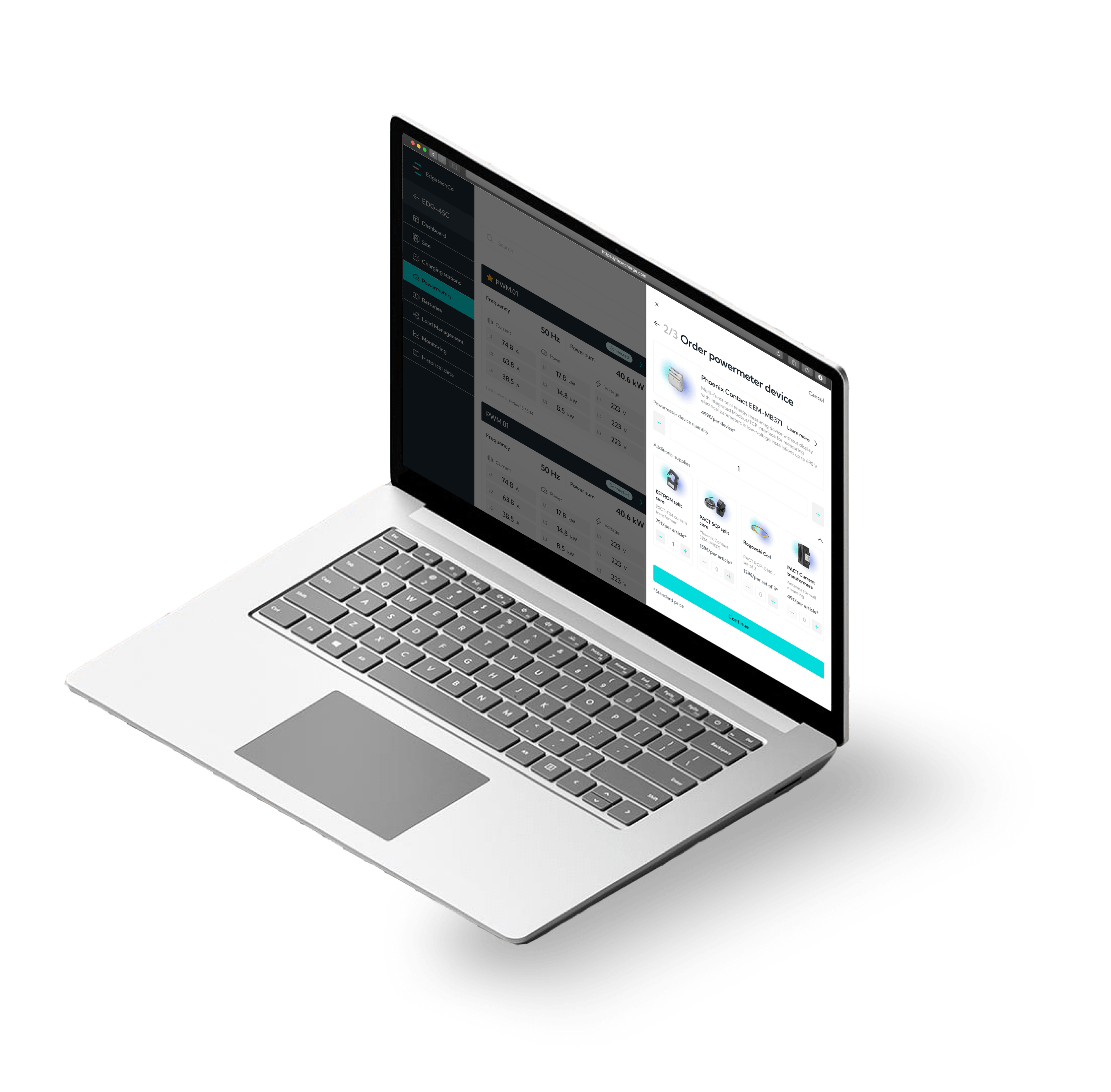
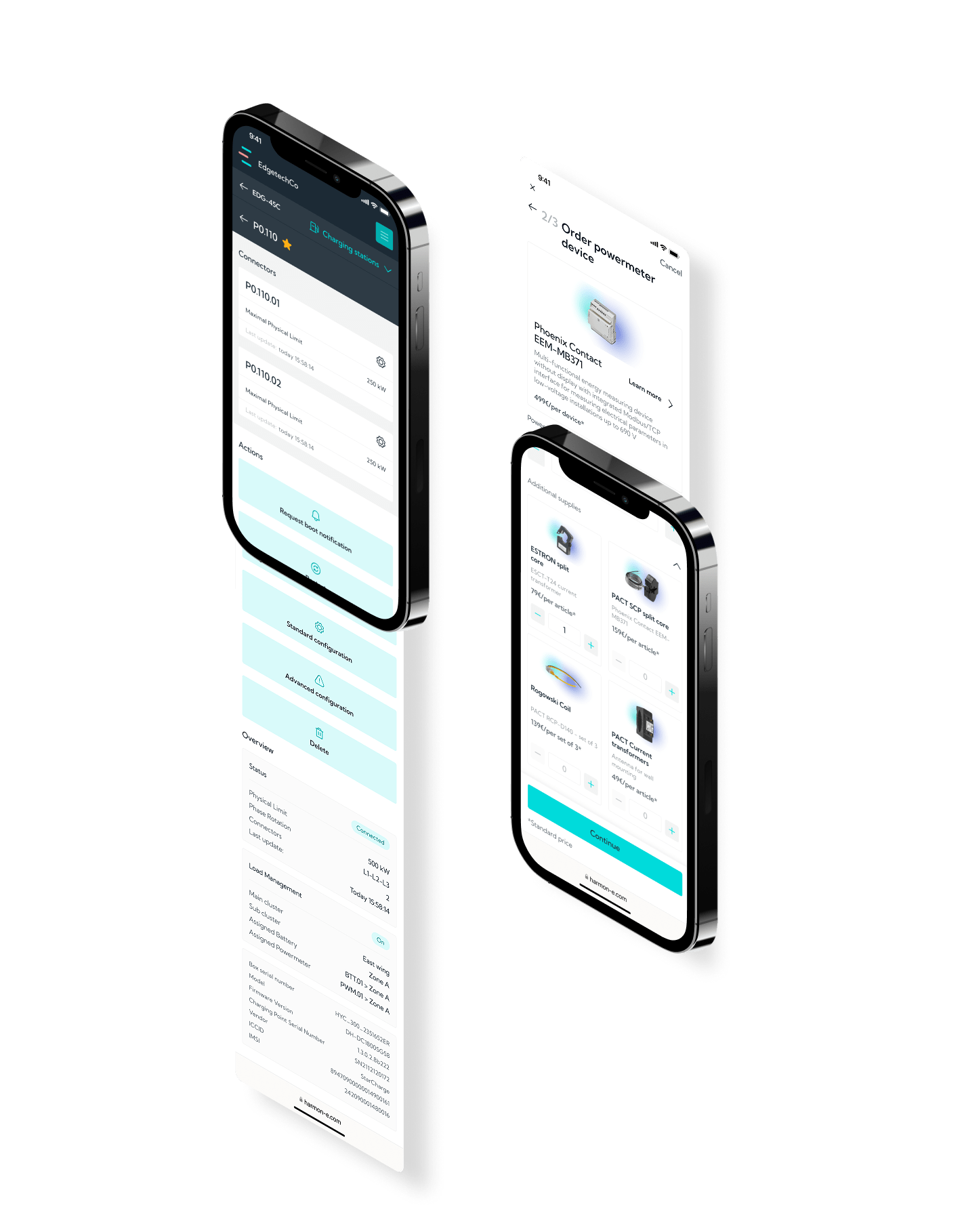
The project began with a comprehensive UX audit to identify key friction points. I then led the UX design process, rethinking user flows to significantly improve user autonomy. Previously, users often had to rely on the company’s support team for basic actions; now, the platform empowers them to manage tasks independently.

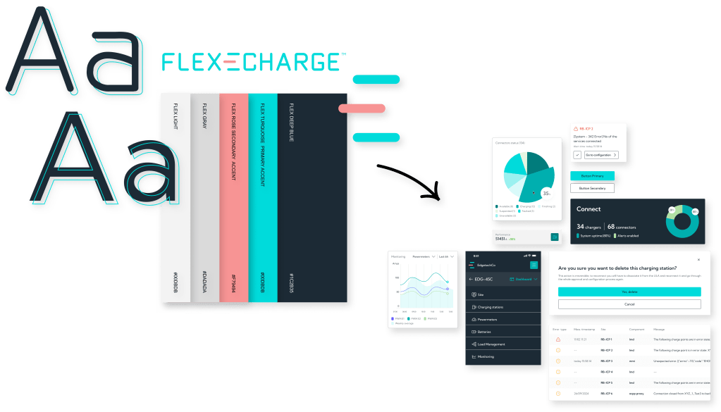
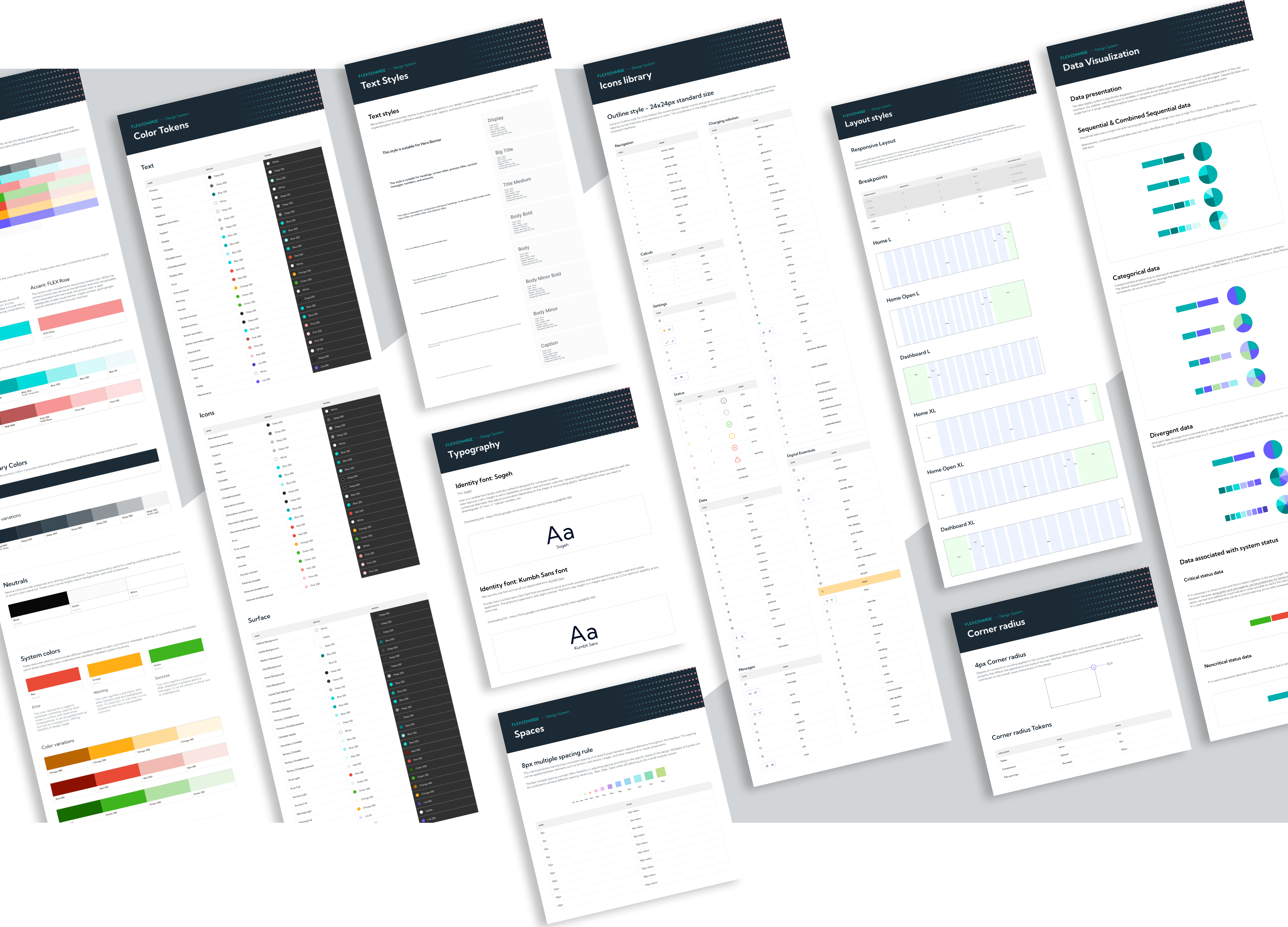
Working in UI sprints using Figma, I implemented a scalable design architecture and introduced new features with a strong focus on usability. I also created and developed a robust design system to ensure visual consistency and support future product evolution.

The result: a modern, intuitive platform that enhances autonomy, efficiency, and scalability.

UX audit / Concept design / Design system set up/ Figma mentoring / UX consulting / UI full revamp / Responsive screens / UX writing

1.Kick-off: bridging gaps and building foundations

From day one, I worked closely with the Product Owner and development team as the sole designer on the project. One of the first challenges was introducing them to a new way of working: I guided the team through the fundamentals of Design Thinking and integrated Agile Design Sprints into our process. This helped align stakeholders and created a shared understanding of the user-centered approach we were about to take.

In parallel, I began an in-depth UX audit of the existing platform. This revealed critical friction points — including a lack of user autonomy, unclear navigation, and heavy reliance on customer support for simple tasks. These insights shaped our priorities for the redesign.

Graphic composition featuring different phases of the UX audit process: including project planning, business analysis, workshop extracts, competitive analysis and wireframes.

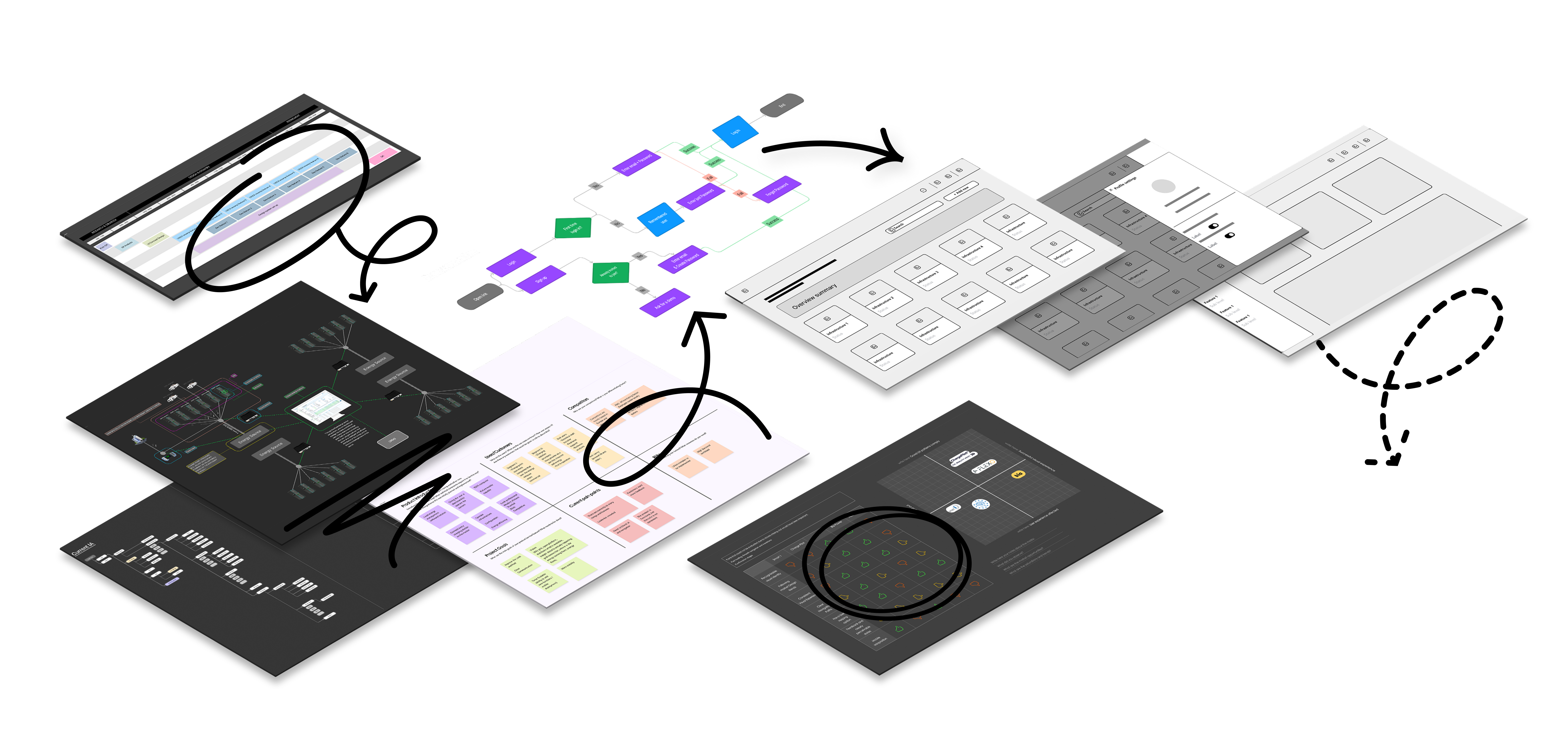
2.Concept & Strategy: turning a rebrand into a product identity

While the company had recently rebranded, their digital product hadn’t caught up. In the Concept phase, I translated their new brand identity into a robust digital style guide, defining color schemes, typography, components, and layout principles tailored for digital contexts. This ensured consistency across all screens and interactions and became the backbone of the visual language for the product moving forward.

Graphic composition showing how to integrate elements of the corporate identity into coherent components of a design system

3. Design & Collaboration: from friction to flow

With a clear vision in place, I led the UX redesign, starting by rethinking user flows to prioritize autonomy and self-service. Users who previously depended on support for basic operations were now able to complete tasks independently — a major shift in usability and customer satisfaction.

Throughout the project, I collaborated closely with developers and the PO in weekly UI sprints using Figma. I created a scalable design architecture that could grow with the product, while introducing thoughtful new features to meet the expectations of increasingly tech-savvy users. My role also involved proactively advising the team on product direction — identifying opportunities to simplify workflows, add value, and respond to emerging user needs.

Extract from a user flow showing the different user paths

4. Systematization: building for the future

To support long-term scalability and consistency, I developed a robust design system tailored to FlexEcharge’s needs. This system not only streamlined current development but also empowered the internal team to continue evolving the product independently.

Graphic composition showing different frames and organization of the Core part of the design system

5. Impact: a platform that scales with its vision

The result is a modern, intuitive, and scalable platform that dramatically improved user autonomy and operational efficiency. Beyond usability improvements, the project had a tangible business impact: the revamped product helped FlexEcharge secure new investment and position itself as an emerging reference in its sector.

See how they are doing ⤵︎